Modernism, matchboxes & little magazines: designing the cover of gorse no. 1
By Niall McCormack.
Working as an illustrator and designer can have its ups and downs but every once in a while a commission comes along which is attune to your aesthetic concerns while allowing you the freedom to fully explore them.. One such commission came my way when I was approached to create a cover for the first issue of a new Irish literary journal, one which takes as reference points Hubert Butler, The Bell, the Paris Review and transition
I have written about the cover design of Irish literary magazines on the Vintage Irish Book Covers blog – so I was aware not only of the history of the form but also of the central role played by the visual aspect of such magazines. Since their inception little magazines have been at the vanguard of the visual arts, embracing the Arts and Crafts and aesthetic movement in the late 19th century and then the many forms of modernism in the early 20th century.
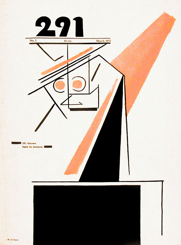
291 (USA) 1915. Cover by Marius de Zayas.
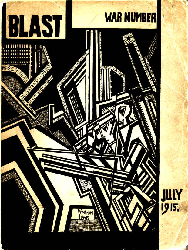
Blast (England) 1915. Cover by Wyndham Lewis.
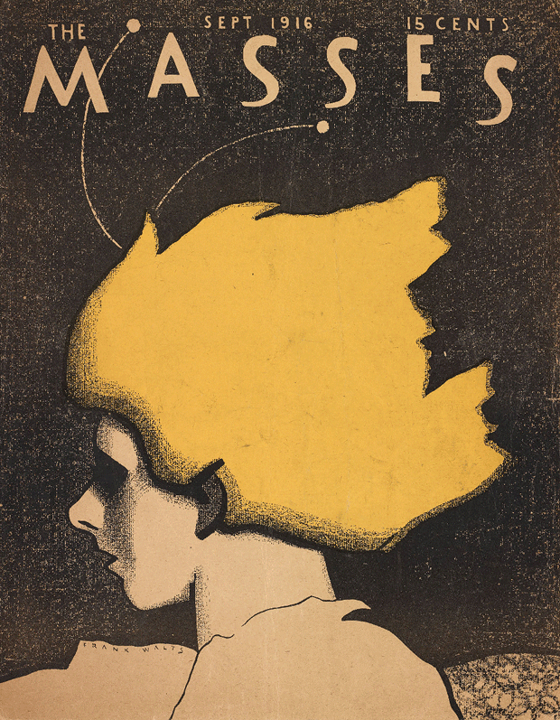
The Masses (USA) 1916. Cover by Frank Walts.
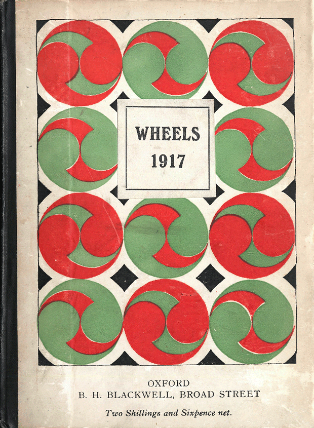 

Wheels (England) 1917. Cover by C.W. Beaumont.
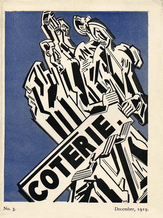
Coterie (England) 1919. Cover by William Roberts.
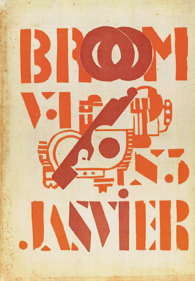 

Broom (Italy) 1922. Cover by Fernand Léger.
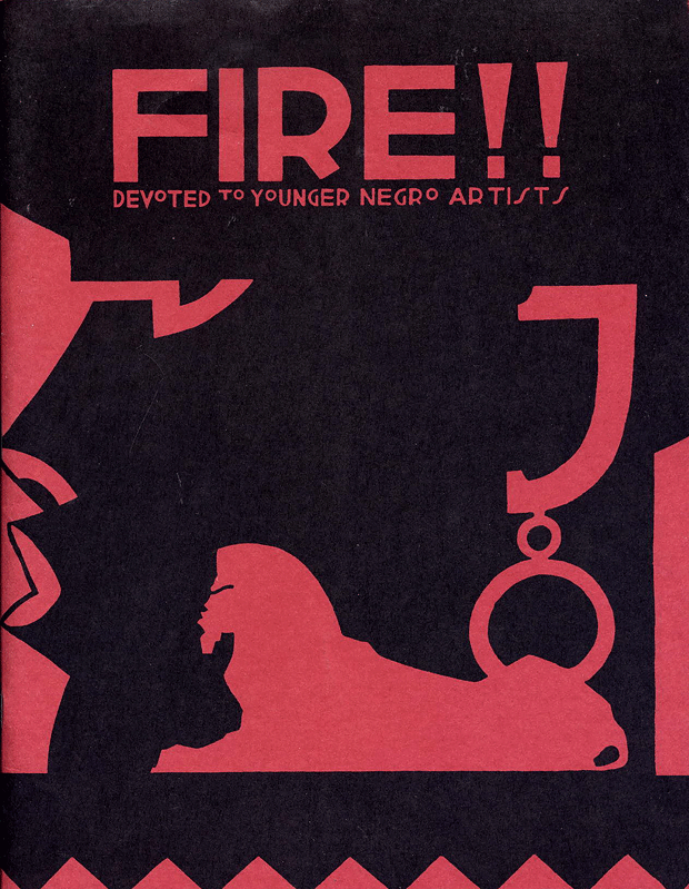
Fire!! (USA) 1926. Cover by Aaron Douglas.
Ireland wasn’t immune to the little magazine phenomenon and the year 1923 saw the launch of two titles, The Klaxon and The Dublin Magazine. A.J. ‘Con’ Leventhal edited The Klaxon under the pseudonym Lawrence K. Emery and saw it as “a whiff of Dadaist Europe to kick Ireland into artistic wakefulness.” Unfortunately, Ireland wasn’t quite ready and the title only lasted one issue. The Dublin Magazine, a far more staid affair, managed a much longer run, surviving until 1958. Early issues sported a beautiful cover by Harry Clarke.
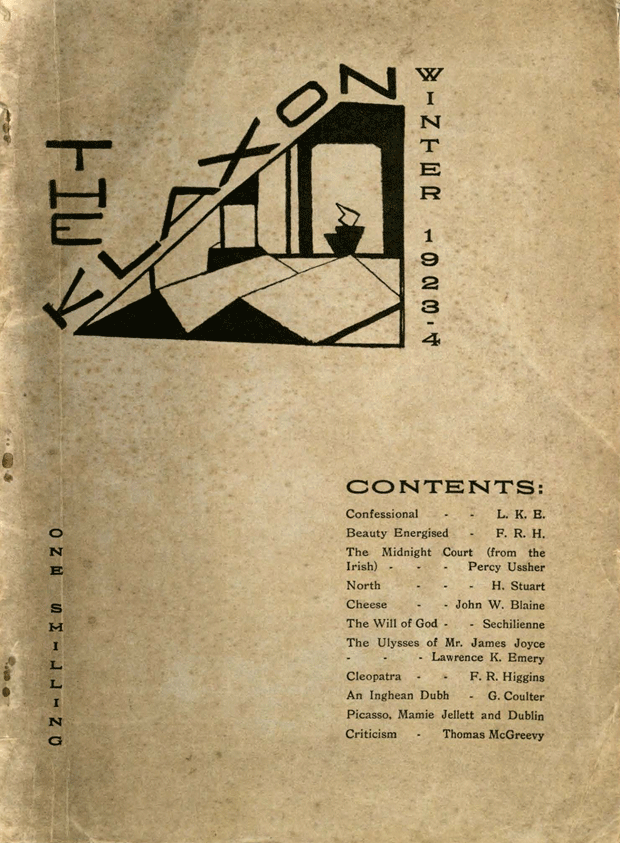 

The Klaxon (Ireland) 1923. Cover design uncredited.
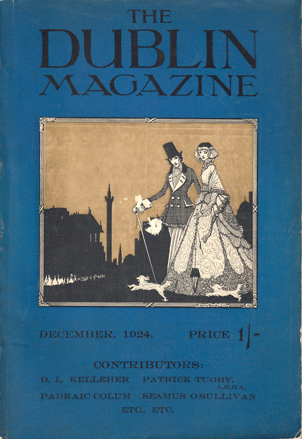
The Dublin Magazine (Ireland) 1924. Cover by Harry Clarke.
The Bell was arguably Ireland’s most important little magazine of the 20th century. Its influence has certainly been far reaching and it is little surprise to find it listed as one of the inspirations for gorse.
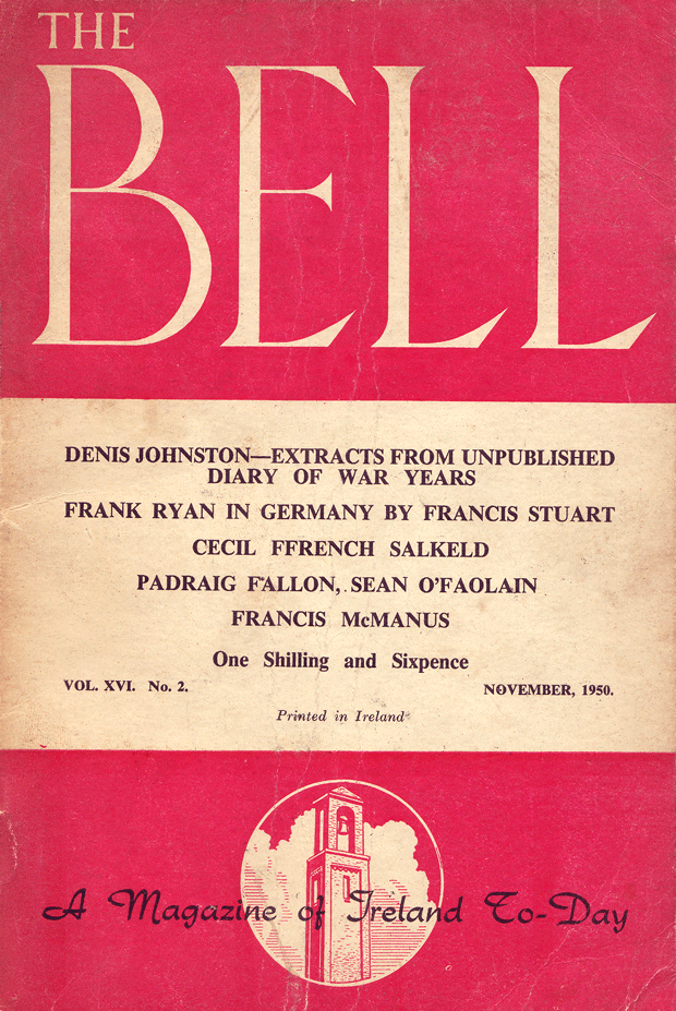
The Bell (Ireland) 1950. Cover design uncredited.
I wanted to create a design which placed gorse within the tradition of modernist little magazines and also reflected some of the ideas covered in the first issue: memory, modernism, exile, experiment and translation. While most of the featured writers were Irish, much of the writing looked to different aspects of Europe in the 20th century.
My work draws heavily on the graphic language of the past and I’m particularly drawn to matchbox label art from mid-century Europe. The labels represent a form of popular modernism, a repurposing of avant-garde modernism for wider consumption. With flat blocks of colour, limited palette and rough printing, the labels share much in common with little magazine covers. It was decided to use this matchbox label art as the stylistic framework for the cover design.
Below is a progression of cover drafts from initial ideas to the penultimate design. After playing around with arrows, an abstracted letter ‘g’ and explosions without much success, I decided to explore the typewriter as a possible symbol, albeit a clichéd one. By moving away from an obvious keyboard form, I found that the keys looked more like pins on a map or interconnections of ideas. In fact, having them in a more disordered fashion gives it a sense of something complex and non-linear.
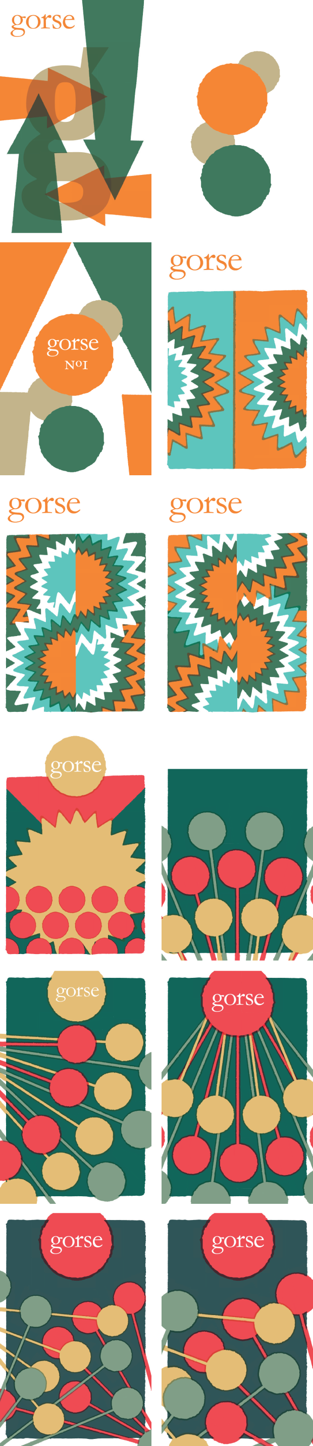 

Various cover drafts, gorse no. 1.
The final draft in the progression was very nearly the finished cover but I wasn’t quite satisfied. To let the design breath a bit, I reduced the number of colours from four to three. Then, while looking at a print-out, I inadvertently turned it upside down and was surprised to find the composition much stronger with the design inverted. So the final cover has the gorse ‘masthead’ at the bottom, something which most publishers would balk at but which seems fitting for a journal which seeks to promote the unconventional.
Once I was happy with the composition I set about achieving the rough print effect particular to matchbox labels. A more in-depth process of a similar piece can be viewed here.
I am delighted that the finished cover has been shortlisted by the Association of Illustrators in the book category of their 2014 Awards.
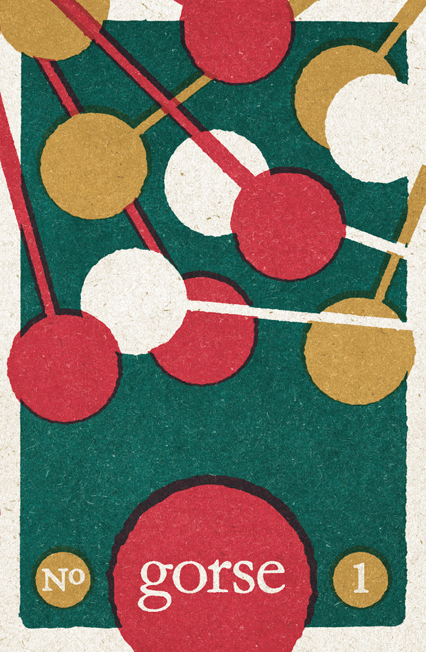
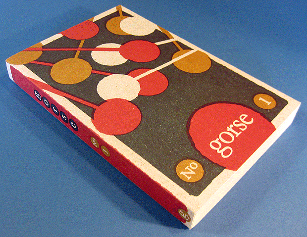
gorse no. 1 (Ireland) 2014. Cover by Niall McCormack.
ABOUT THE AUTHOR
Niall McCormack is a commercial artist based in Dublin, Ireland, specialising in music packaging and book cover design. He writes about Irish book cover design on his blog, Vintage Irish Book Covers, and has curated exhibitions of book cover art including a retrospective of the work of Dutch designer Cor Klaasen, as well as writing the introduction Vintage Values, a book of cover art from the Catholic Truth Society of Ireland archive spanning the 1920s to the 1960s. As Hi Tone Books Niall has published Where Were You? Dublin Youth Culture & Street Style 1950-200 by Garry O’Neill (2011) and The Other Half Lives: Photographs 1989-1993 by Wally Cassidy (May 2014).