A Kind of Blue
‘Suppose I was to begin by saying that I had fallen in love with a color.’ – Maggie Nelson
‘A good painter needs only three colours: black, white, and red,’ Titian said. Blacks (‘nothing is black—really nothing’): master of ‘the aesthetics of negation’ Ad Reinhardt’s ‘ultimate paintings’ (consider point six1 in Reinhardt’s 12 Rules for Pure Art); Anish Kapoor’s acquisition of Vantablack, the ‘blackest black’ pigment (‘it’s blacker than anything you can imagine,’ says Kapoor, ‘so black you almost can’t see it’); Goya’s Saturn Devouring His Son; Malevich’s Black Square. Fierce and definite whites: Malevich’s White on White; Rauschenberg’s Erased De Kooning; Rauschenberg’s White Paintings which in turn inspired John Cage’s 4’33” (‘I have nothing to say and I am saying it, and that is poetry’). The elusive red, its effect, according to Goethe, ‘as peculiar as its nature.’ Witness Matisse’s Harmony in Red; Félix Vallaton’s La Chambre Rouge; Otto Dix’s Portrait of the Journalist Sylvia Von Harden; Edvard Munch’s The Scream.
And yet, it is not black, nor white, nor red, but a pure ultramarine that dazzles in Titian’s painting for the camerino d’alabastro, a god tumbling from his chariot and promising her the stars (‘Who besides me knows what Ariadne is!’)? ‘It is Giotto who first let sky into paintings,’ Anne Carson tells us, but it is experimental artist Yves Klein who, for all his influence on conceptual and performance art and love of unpredictable techniques and use of (anti)materials to create art, sat under an ultramarine sky on a beach in Nice in 1947 and decided on a shade of blue2 that would eradicate the division of heaven and earth. ‘The blue sky is my first artwork.’
After mastering judo, an immersion in Rosicrucianism, and after a spell in Kildare working as a stable-hand with poet Claude Pascal, yet before leaping into the void,3 and before his ‘fire’ paintings, Klein entered his époque bleue, marked with the release of 1,001 helium-filled blue balloons in Saint-Germain-des-Prés, and an exhibition in Gallery One, London. Bernard Levin dismissed Klein and his ‘cheap poster-paint,’ while an Observer critic called it all ‘quite lunatic… If people are foolish enough to take such nonsense seriously one can only congratulate the hoaxer. What has confused the issue is the undeniable fact that M Klein has raised a genuine philosophical-mystical problem: that of the contemplation of colour by itself and for itself. But this has little to do with art.’
‘Black A, white E, red I, green U, blue O—vowels,’ Rimbaud sounded, considering letters as colours as part of his quest to trouver une langue (find a language). Nabokov saw an entire alphabet of colours, describing his experience of being a synesthete in Speak, Memory:
I present a fine case of coloured hearing. Perhaps ‘hearing’ is not quite accurate, since the colour sensations seem to be produced by the very act of my orally forming a given letter while I imagine its outline. The long a of the English alphabet (and it is this alphabet I have in mind farther on unless otherwise stated) has for me the tint of weathered wood, but the French a evokes polished ebony. This black group also includes hard g (vulcanised rubber) and r (a sooty rag being ripped). Oatmeal n, noodle-limp l, and the ivory-backed hand mirror of o take care of the whites. I am puzzled by my French on which I see as the brimming tension-surface of alcohol in a small glass. Passing on to the blue group, there is steely x, thundercloud z, and huckleberry k. Since a subtle interaction exists between sound and shape, I see q as browner than k, while s is not the light blue of c, but a curious mixture of azure and mother-of-pearl. Adjacent tints do not merge, and dipthongs do not have special colours unless represented by a single character in some other language (thus the fluffy-gray, three-stemmed Russian letter that stands for sh, a letter as old as the rushes of the Nile, influences its English representation).
Curiously, one of Nabovov’s most used words in his works was (alongside ‘banal’ and ‘pun’) ‘mauve.’4 As a translator, Nabokov would have been conscious that the Ancients did not have a word for ‘blue.’ In 1858 William Gladstone counted the colour references in Homer’s Odyssey and found blue wasn’t mentioned at all. The word ‘purple,’ Anne Carson tells us, ‘comes from Latin purpureus, which comes from Greek porphyra, a noun denoting the purplefish. This sea mollusk, properly the purple limpet or murex, was the source from which all purple and red dyes were obtained in antiquity.’5 Hence Homer’s ‘wine-dark sea.’
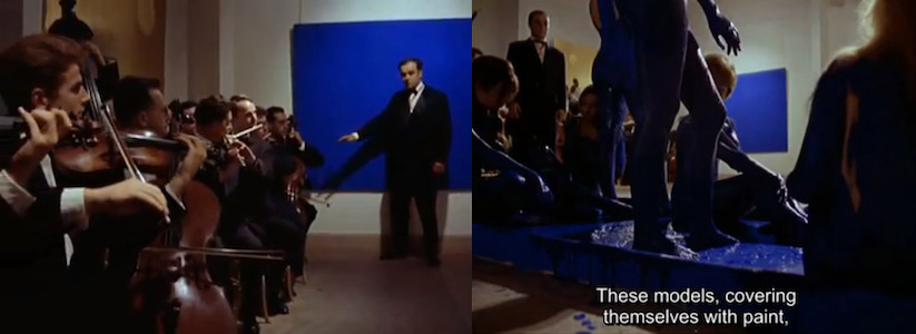
Carson’s Float includes a list of moments in Klein’s life and career, including the blue period: ‘The Era of the Deciding That Line Is Jealous of Color Line Is a Tourist in Space,’ ‘The Era of the Blue Obsession,’ ‘The Era of Patenting International Klein Blue (Henceforth IKB),’ ‘The Era of Drinking Cocktails of the Void and Urinating Blue for a Week.’ But Klein’s undoing was ‘The Era of Allowing an Italian Director to Make a Film of One’s Life and Work Which the Director Turns into a Grotesque Comedy (Mondo Cane) and Exhibits at Cannes.’ Mondo Cane, a ‘documentary’ shot by Paolo Cavara, Franco Prosperi, and Gualtiero Jacopetti, had a segment featuring one of Klein’s anthropométries: Mondo Cane Shroud. Decked out in a tailcoat and bowtie, Klein conducted an orchestra playing his Monotone-Silence Symphony (a single note drawn out for twenty minutes, followed by a further twenty minutes of silence), and directed three naked models as they covered themselves with blue paint and rolled directly on a white canvas. The models were ‘living brushes.’ Klein explained it thus: ‘By maintaining myself at a specific and obligatory distance from the surface to be painted, I am able to resolve the problem of detachment.’6
Often exploitative, sometimes fake, Klein’s work peaked the directors’ interests because they admired what they felt was the artist’s sensational objectification of women. In Mark Goodall’s book Sweet & Savage: The World Through the Shockumentary Film Lens, JG Ballard speaks admiringly of Mondo Cane as ‘an important key to what was going on in the media landscape of the 1960s, especially post the JFK assassination. Nothing was true, and nothing was untrue.’ The screening in Cannes, though, from which Klein was unable to detach himself, was a humiliation, and lead to, as Carson puts it, ‘The Era of the Heart Attack in Late Afternoon.’ Unable to recover from the shock of the film, Klein suffered two further heart attacks, disappearing off into the wild blue yonder one month later, leaving Mondo Cane Shroud as a kind of empyreal shroud of the artist.
[From gorse no. 9, October 2017 | PDF]
1. ‘No colors. ‘Color blinds.’ ‘Colors are an aspect of appearance and so only of the surface,’ and are ‘a distracting embellishment.’ Colors are barbaric, unstable, suggest life, ‘cannot be completely controlled’ and ‘should be concealed.’ No white. ‘White is a color, and all colors.’ White is ‘antiseptic and not artistic, appropriate and pleasing for kitchen fixtures, and hardly the medium for expressing truth and beauty.’ White on white is ‘a transition from pigment to light’ and ‘a screen for the projection of light’ and ‘moving’ pictures.’ Art as Art: The Selected Writings of Ad Reinhardt (Viking Press, 1975)↩
2. As early as 1956, Klein experimented with a polymer binder to preserve the luminescence and powdery texture of raw yet unstable ultramarine pigment. In 1960, he patented International Klein Blue (IKB), a paint colour that he considered to unlock the endless void of space. Developed with a chemical retailer, IKB used a clear, colourless carrier (unlike traditional binders, which had a dulling effect) to suspend pure, dry pigment, maintaining its original intensity↩
3. Leap Into the Void, Klein’s infamous 1960 black-and-white photograph, depicts the artist seemingly jumping into space from the parapet of a building on a quiet street. A feat of trickery, the image is in fact a photo-montage made by Harry Shunk and János Kender, with Klein launching himself onto a tarpaulin held by a group of his judoka friends who were later edited out. The photograph was published in Dimanche (Le journal d’un seul jour), Klein’s parody of a Sunday newspaper↩
4. According to statistics, Nabokov used the word ‘mauve’ at a rate that is forty-four times higher than the rate at which it occurs in the Brigham Young University sample of written English. Nabokov’s Favorite Word Is Mauve: What the Numbers Reveal About the Classics, Bestsellers, and Our Own Writing, Ben Blatt (Simon & Schuster, 2017)↩
5. ‘Variations on the Right to Remain Silent,’ Float, Anne Carson (Knopf, 2016)↩
6. The Chelsea Hotel Manifesto, Yves Klein (1961)↩